Wednesday, August 7, 2019

(CAS)E this Sketch #333

Back today, sharing a card I made for a "new to me" Sketch Challenge blog- (CAS)E this Sketch #333. I was drawn in by the sketch because I love to use sketches to guide and push my creativity.


August for us means back to school, and as a school librarian, that means that I am working on getting lesson plans made and getting the library back together to welcome students. I have many teacher friends in my building and also around the state, so I made quite a few cards to encourage and uplift them as we start a new year.

Here is one that I am sending to one of my very best friends who lives in the town where I grew up. She teaches Kindergarten, KINDERGARTEN! I can't wrap my brain around the patience and energy that it requires to teach Kindergarten, but she does it so well! 


I started this card by stamping Tim Holtz's Mini Schoolhouse Blueprint Stamps onto watercolor cardstock and water coloring the image with Candied Apple, Fired Brick, Spun Sugar, and Pine Needles Distress Ink.  The sentiment is from Simon Says Stamp Thank You Teacher stamp set, and it is stamped on a piece of patterned paper from my stash. The red and green patterned pieces are from my stash of paper scraps as well. I used the largest Stitched Rectangle Die from Simon Says Stamp to cut the black cardstock background piece. It is the perfect size to fit on an A2 card base.

I adhered the pieces together and popped up the apple image with foam tape. I finished the card with a few Summer Gold sequins from Simon Says Stamp and a splattering of Perfect Pearls in Sunflower Sparkle.

I enjoyed this sketch challenge and look forward to trying it again in the future.

Sunday, August 4, 2019

Color Throwdown #554

 I loved the color scheme for this week's Color Throwdown.


I wanted to use the same basic materials and try two different techniques for the cards this week. 


Both cards were created using Neenah white 80lb cardstock to create the card bases. I also cut down Desert Storm cardstock and embossed it with older Sizzix embossing folders to create the backgrounds. 

All the stamped pieces are from Altenew's Beautiful Day stamp & die set. The card on the left was stamped in black ink and watercolored using Tim Holtz Distress Inks- Barn Door, Twisted Citron, Lucky Clover, and Peeled Paint. The card on the right was stamped in Altenew mini ink cubes in Red Sunset and Green Fields. Both cards have tan elements stamped in Vintage Photo Distress ink. 

The black pieces are cardstock from my stash and the green, and black and white pieces are washi tape that adhered to white cardstock and layered under the black cardstock. 

I used Hero Arts Gold Embossing powder along the edges of the sentiment strip and the background piece. I also sprinkled loose embossing powder and heated it from underneath on the completed cards to add texture and interest. 

Each card was finished with Gold Stickles and sequins from my stash.

Thanks for stopping by! 


Monday, July 29, 2019

Color Throwdown #553

I loved this week's Color Throwdown combination! Very fun and summery!


Here is my card using this color scheme. 


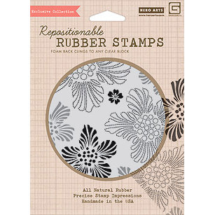
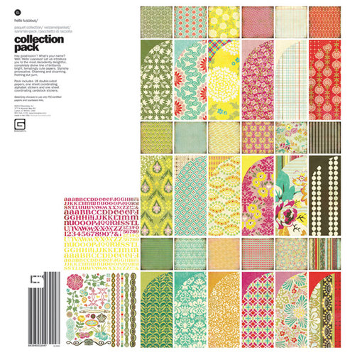
I used an older background stamp from Hero Arts that coordinated with the Hello Luscious paper line from Basic Grey:


Image result for Hero arts CG301Image result for basic grey hello luscious

I really miss the Basic Grey paper lines & stamps. I wish I spent more time sewing to justify purchasing some of their beautiful fabric.

I stamped the Luscious Floral Background stamp (Hero Arts CG301) onto Strathmore Watercolor paper that I had cut down to 4 x 5 1/4 and embossed in Hero Arts white embossing powder.  I then ink blended the background using Distress Inks in Mustard Seed, Spiced Marmalade and Picked Raspberry. Using those same colors, I watercolored them into some of the open flowers to give the background more depth and interest. I finished the background with flicks of water that I dried with a heat gun. 

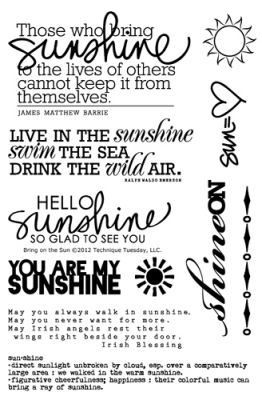
The sentiment is from the Bring on the Sun stamp set from Ali Edwards for Technique Tuesday.
Bring On The Sun Stamp Set by Ali Edwards
This stamp set is from 2012, but one I still reach for summer projects. Stamps are so versatile and
timeless. 

I stamped the sentiment with Distress Oxide Ink in Picked Rasberry onto shimmery vellum from my stash & then heat embossed it. Adhering vellum is always tricky because you don't want the adhesive to show through the vellum. To combat this, I used DMC cross stitch thread to sew the sentiment strip on. 

To finish the card, I used sequins from my stash and Crystal Stickles to fill in the flower centers.

Hope your week is great! Check the Color Throwdown website on Wednesday to see the next challenge and play along! It is a great way to stretch your creativity and use your supplies! 


Sunday, July 21, 2019

Color Throwdown #552

This week's Color Throwdown has pink again, but, this time it's mixed with white, silver, and grey. Those colors, along with going back to using flowers, made this challenge a bit easier for me than last weeks.


Here's my take:


I started with a pink card base and then cut down a piece of Tim Holtz watercolor paper. I stamped floral images from Simon Says Stamp Delicate Flowers (SSS201900) stamp set and embossed them in white. I then used Distress Inks in Spun Sugar and Worn Lipstick to watercolor the floral images.  The leaf images from the same stamp set were stamped in Versamark ink and then embossed with  WOW Embossing Powder in Metallic Silver Ultra High (WC05UH).  This embossing powder is chunkier than most I work with, but I still like the results even though it didn't give polished clean images. To add more interest, I sprinkled that same embossing powder across the background, without embossing ink and then embossed from underneath. That melted the powder without blowing it off the paper. I used Versamark and the same embossing powder along the edges of a piece of paper just a little bit bigger than the watercolored piece to create a mat between the watercolored background and the pink card base. The sentiment, from the same stamp set, was stamped and white heat embossed onto a scrap of grey cardstock. Sequins from my stash complete the card. 

Friday, July 12, 2019

Color Throwdown #551

This color scheme Color Throwdown #551 is not part of my usual repertoire. The pink definitely threw me a little. I live in a home with four boys, one grown-ish and the other three the spitting image of him. Pink is not something I live with daily.

I knew I wanted to push myself a little, and since I had completed the last couple of challenges using flowers, I decided that this time, no flowers. I also wanted to stick to light pink, even though darker pinks might have been a bit easier.

Here's what I came up with:


This card started with a piece of Tim Holtz watercolor cardstock with an ink smooshing technique using Spun Sugar Distress Ink. The splatters were made with watered down black paint. The popped up butterfly is from an older Hero Arts set (CL383) heat embossed in gold embossing powder and then lightly was with Spun Sugar Distress Ink. The sentiment is from the Tim Holtz/Stampers Anonymous Handwritten Thoughts (CMS218) set. I finished the card by stitching a butterfly flight path in metallic gold thread and then scattering pieces of gold confetti along that path. 


This second card began on Tim Holtz watercolor cardstock as well. I repeatedly stamped, and white heat embossed an old Cocoa Daisy quatrefoil stamp onto the background. I then used Black Soot Distress Ink and the ink smooshing technique to cover the whole background. I went back and added darker black spots and then splashed on a few water drops to add interest. The gold background was created using gold glitter embossing powder on the card edges. I wanted it to match the die cut "love" word. The die cut is popped up on a Spun Sugar Distress Ink heart, and a Tim Holtz rosette die made from scrap polka dot tissue paper. A scattering of sequins and the word you from the Simon Says Stamp Hey Love release finished the card.

Cocoa Daisy- Creating with Old Kits #3

Here I am again, playing with an older Cocoa Daisy kit that I absolutely loved when I bought it and then didn't use very much of. I am so glad that I kept my kits together and organized so that I can now pull them back out and play.

This August 2014 kit was full of amazing products that I could not pass up. I purchased the main kit, the Thrift Shop add-on, the Flea Market patterned paper add-on and the Day in the Life Kit. I bought so much there was a ton left to play with today.


My layout was created using a mix of elements from all the August kits, along with older scrapbook elements, and newer products as well. I usually use cardstock as the base for my layouts, but I loved this ombre patterned paper so I chose to build my layout on it. 

This week's Cocoa Daisy challenge was to use planner supplies on a scrapbook layout or scrapbook products in a planner. So I went digging through my planner supplies and pulled out a few things to use. The 3x4 card is from an earlier planner kit, the label behind the swim word veneer is from a subscriber's planner printable, the "Present Moment = Wonderful Moment" is from the July 2016 planner notepad, the "Life is a Wave, Catch it" sticker is from the July 2016 planner stickers & the heart puffy sticker is from the November 2017 planner puffy stickers.   


Other products used on this layout that are not part of the August kit include:

Older:
"Sunny Days" Kaleidotitle from My Mind's Eye (2006)
Crate Paper Poolside Wood Veneer (2015) 

Newer:


Monday, July 8, 2019

Cocoa Daisy- Creating with Old Kits #2

Today I'm using an old kit, a new picture, and a sketch to create a 12x12 layout.

The sketch is from Cocoa Daisy's Memory Keeping FB page:

No photo description available.

The older CD kit is July 2011's, Urban Loft. It is one of my all time favorite kits. I ended up buying the kit, the Pencil Factory add-on kit, and a project kit from Ronda Palazzari that July. Then a few months later they had a box sale, and I picked up remnants of the kit in that sale. So much love for this kit and plenty left to play with!  

Image result for cocoa daisy july 2011 urban loft

Here is my take on the sketch using this amazing old kit:


When I opened the bag with this kit in it, tons of little scraps of patterned paper fell out. So glad I hoard even the smallest of pieces.


The yellow card stock was cut down to 11 1/2 x11 1/12 to accommodate the teal cardstock that it is matted on. I used an older The Crafter's Workshop 12x12 Sunburst stencil and Tim Holtz Distress Ink in Squeezed Lemonade, Mustard Seed, and Carved Pumpkin (TCW166) to create offset sunrays in the background. The splatters are from an old Tattered Angels Glimmer Mist. I loved this color! It is so old that the spray nozzle finally got too clogged to spray anymore, so I pushed the lid down on top of it and I now dip a paintbrush in to use the last little bits. 


I played with the scraps of patterned paper to create a pieced together background that I liked. I matted the photo of Jude on a larger scrap of patterned paper from the kit and then popped it up with foam tape on top of the patterned paper background. 

There was a small piece of lined pattern paper that was perfect for journaling, and those Sassafras Lass Sweet Treat stickers were great to: 
  1. hide a bright pink ball in the bottom right corner of the photo,
  2. house the layout title,
  3. take up space at the bottom of the journaling, and 
  4. add a third element that helped balance the layout.

The title was created using Sassafras Lass Slate colored cardstock alpha stickers from the kit, which was then coated with Glossy Accents. Sweet and Lovely was part of the original sticker. 

There were a few buttons in the kit, and I added a few from my own stash to them. I had to stitch them on because an unstitched button on a project weirds me out. It must be a pet peeve, and it's totally a weird thing I do. There is also a word element/button on the page as well, on top of the heart. That came from my stash as well and is super old. Maybe Little Davis Designs or Queen & Co.... so old, I'm not even sure where it came from. The yellow gems are brads from my stash also. 

I love how this layout turned out, and I loved playing with this older kit. 

I miss Sassafrass Lass, even though their pattern paper usually was bolder and louder than I typically use, I still loved adding an element here or there on a layout to add a little boldness or sense of whimsy. Plus their alpha's were amazing. 

I found a few elements in the kit I want to create a project with, including a half-finished mini album that I started foundation pages for years ago, a package of Pink Paislee Heidi Swapp bright yellow quarterfoil printed tissue paper (so amazing), and of course I need to finish the 10 Things mini album project from Ronda Palazzari.

Wishing you a productive and crafty afternoon. Go dig around and play with some old stuff!