Monday, July 29, 2019

Color Throwdown #553

I loved this week's Color Throwdown combination! Very fun and summery!


Here is my card using this color scheme. 


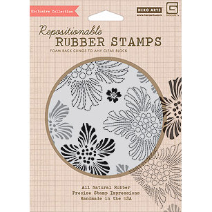
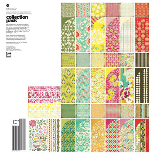
I used an older background stamp from Hero Arts that coordinated with the Hello Luscious paper line from Basic Grey:


Image result for Hero arts CG301Image result for basic grey hello luscious

I really miss the Basic Grey paper lines & stamps. I wish I spent more time sewing to justify purchasing some of their beautiful fabric.

I stamped the Luscious Floral Background stamp (Hero Arts CG301) onto Strathmore Watercolor paper that I had cut down to 4 x 5 1/4 and embossed in Hero Arts white embossing powder.  I then ink blended the background using Distress Inks in Mustard Seed, Spiced Marmalade and Picked Raspberry. Using those same colors, I watercolored them into some of the open flowers to give the background more depth and interest. I finished the background with flicks of water that I dried with a heat gun. 

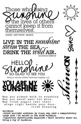
The sentiment is from the Bring on the Sun stamp set from Ali Edwards for Technique Tuesday.
Bring On The Sun Stamp Set by Ali Edwards
This stamp set is from 2012, but one I still reach for summer projects. Stamps are so versatile and
timeless. 

I stamped the sentiment with Distress Oxide Ink in Picked Rasberry onto shimmery vellum from my stash & then heat embossed it. Adhering vellum is always tricky because you don't want the adhesive to show through the vellum. To combat this, I used DMC cross stitch thread to sew the sentiment strip on. 

To finish the card, I used sequins from my stash and Crystal Stickles to fill in the flower centers.

Hope your week is great! Check the Color Throwdown website on Wednesday to see the next challenge and play along! It is a great way to stretch your creativity and use your supplies! 


Sunday, July 21, 2019

Color Throwdown #552

This week's Color Throwdown has pink again, but, this time it's mixed with white, silver, and grey. Those colors, along with going back to using flowers, made this challenge a bit easier for me than last weeks.


Here's my take:


I started with a pink card base and then cut down a piece of Tim Holtz watercolor paper. I stamped floral images from Simon Says Stamp Delicate Flowers (SSS201900) stamp set and embossed them in white. I then used Distress Inks in Spun Sugar and Worn Lipstick to watercolor the floral images.  The leaf images from the same stamp set were stamped in Versamark ink and then embossed with  WOW Embossing Powder in Metallic Silver Ultra High (WC05UH).  This embossing powder is chunkier than most I work with, but I still like the results even though it didn't give polished clean images. To add more interest, I sprinkled that same embossing powder across the background, without embossing ink and then embossed from underneath. That melted the powder without blowing it off the paper. I used Versamark and the same embossing powder along the edges of a piece of paper just a little bit bigger than the watercolored piece to create a mat between the watercolored background and the pink card base. The sentiment, from the same stamp set, was stamped and white heat embossed onto a scrap of grey cardstock. Sequins from my stash complete the card. 

Friday, July 12, 2019

Color Throwdown #551

This color scheme Color Throwdown #551 is not part of my usual repertoire. The pink definitely threw me a little. I live in a home with four boys, one grown-ish and the other three the spitting image of him. Pink is not something I live with daily.

I knew I wanted to push myself a little, and since I had completed the last couple of challenges using flowers, I decided that this time, no flowers. I also wanted to stick to light pink, even though darker pinks might have been a bit easier.

Here's what I came up with:


This card started with a piece of Tim Holtz watercolor cardstock with an ink smooshing technique using Spun Sugar Distress Ink. The splatters were made with watered down black paint. The popped up butterfly is from an older Hero Arts set (CL383) heat embossed in gold embossing powder and then lightly was with Spun Sugar Distress Ink. The sentiment is from the Tim Holtz/Stampers Anonymous Handwritten Thoughts (CMS218) set. I finished the card by stitching a butterfly flight path in metallic gold thread and then scattering pieces of gold confetti along that path. 


This second card began on Tim Holtz watercolor cardstock as well. I repeatedly stamped, and white heat embossed an old Cocoa Daisy quatrefoil stamp onto the background. I then used Black Soot Distress Ink and the ink smooshing technique to cover the whole background. I went back and added darker black spots and then splashed on a few water drops to add interest. The gold background was created using gold glitter embossing powder on the card edges. I wanted it to match the die cut "love" word. The die cut is popped up on a Spun Sugar Distress Ink heart, and a Tim Holtz rosette die made from scrap polka dot tissue paper. A scattering of sequins and the word you from the Simon Says Stamp Hey Love release finished the card.

Cocoa Daisy- Creating with Old Kits #3

Here I am again, playing with an older Cocoa Daisy kit that I absolutely loved when I bought it and then didn't use very much of. I am so glad that I kept my kits together and organized so that I can now pull them back out and play.

This August 2014 kit was full of amazing products that I could not pass up. I purchased the main kit, the Thrift Shop add-on, the Flea Market patterned paper add-on and the Day in the Life Kit. I bought so much there was a ton left to play with today.


My layout was created using a mix of elements from all the August kits, along with older scrapbook elements, and newer products as well. I usually use cardstock as the base for my layouts, but I loved this ombre patterned paper so I chose to build my layout on it. 

This week's Cocoa Daisy challenge was to use planner supplies on a scrapbook layout or scrapbook products in a planner. So I went digging through my planner supplies and pulled out a few things to use. The 3x4 card is from an earlier planner kit, the label behind the swim word veneer is from a subscriber's planner printable, the "Present Moment = Wonderful Moment" is from the July 2016 planner notepad, the "Life is a Wave, Catch it" sticker is from the July 2016 planner stickers & the heart puffy sticker is from the November 2017 planner puffy stickers.   


Other products used on this layout that are not part of the August kit include:

Older:
"Sunny Days" Kaleidotitle from My Mind's Eye (2006)
Crate Paper Poolside Wood Veneer (2015) 

Newer:


Monday, July 8, 2019

Cocoa Daisy- Creating with Old Kits #2

Today I'm using an old kit, a new picture, and a sketch to create a 12x12 layout.

The sketch is from Cocoa Daisy's Memory Keeping FB page:

No photo description available.

The older CD kit is July 2011's, Urban Loft. It is one of my all time favorite kits. I ended up buying the kit, the Pencil Factory add-on kit, and a project kit from Ronda Palazzari that July. Then a few months later they had a box sale, and I picked up remnants of the kit in that sale. So much love for this kit and plenty left to play with!  

Image result for cocoa daisy july 2011 urban loft

Here is my take on the sketch using this amazing old kit:


When I opened the bag with this kit in it, tons of little scraps of patterned paper fell out. So glad I hoard even the smallest of pieces.


The yellow card stock was cut down to 11 1/2 x11 1/12 to accommodate the teal cardstock that it is matted on. I used an older The Crafter's Workshop 12x12 Sunburst stencil and Tim Holtz Distress Ink in Squeezed Lemonade, Mustard Seed, and Carved Pumpkin (TCW166) to create offset sunrays in the background. The splatters are from an old Tattered Angels Glimmer Mist. I loved this color! It is so old that the spray nozzle finally got too clogged to spray anymore, so I pushed the lid down on top of it and I now dip a paintbrush in to use the last little bits. 


I played with the scraps of patterned paper to create a pieced together background that I liked. I matted the photo of Jude on a larger scrap of patterned paper from the kit and then popped it up with foam tape on top of the patterned paper background. 

There was a small piece of lined pattern paper that was perfect for journaling, and those Sassafras Lass Sweet Treat stickers were great to: 
  1. hide a bright pink ball in the bottom right corner of the photo,
  2. house the layout title,
  3. take up space at the bottom of the journaling, and 
  4. add a third element that helped balance the layout.

The title was created using Sassafras Lass Slate colored cardstock alpha stickers from the kit, which was then coated with Glossy Accents. Sweet and Lovely was part of the original sticker. 

There were a few buttons in the kit, and I added a few from my own stash to them. I had to stitch them on because an unstitched button on a project weirds me out. It must be a pet peeve, and it's totally a weird thing I do. There is also a word element/button on the page as well, on top of the heart. That came from my stash as well and is super old. Maybe Little Davis Designs or Queen & Co.... so old, I'm not even sure where it came from. The yellow gems are brads from my stash also. 

I love how this layout turned out, and I loved playing with this older kit. 

I miss Sassafrass Lass, even though their pattern paper usually was bolder and louder than I typically use, I still loved adding an element here or there on a layout to add a little boldness or sense of whimsy. Plus their alpha's were amazing. 

I found a few elements in the kit I want to create a project with, including a half-finished mini album that I started foundation pages for years ago, a package of Pink Paislee Heidi Swapp bright yellow quarterfoil printed tissue paper (so amazing), and of course I need to finish the 10 Things mini album project from Ronda Palazzari.

Wishing you a productive and crafty afternoon. Go dig around and play with some old stuff!


Cocoa Daisy- Creating With Old Kits #1

My scrap space is FULL of stuff! Even after all the times I have cleaned up and cleared out, I still have a large amount of stuff, that I can't part with. Years of collecting Cocoa Daisy scrapbook kits take up a significant amount of my space. Each month I go back through my Cocoa Daisy collection and try to pull kits I want to play with. Many of these kits are only partially used and live in their original bags except for the embellishments that tend to add bulk. So any embellishments that aren't flat are in smaller bags with the kit date, so I can locate them when I am using the kit.

Today's 12x12 layout uses a current picture and a very old kit. The kit I am using is Verandah from June 2009. 


I am pleased with my layout, and upon completing it, I found myself reminded that the people who will be looking at this layout and reading this story have no idea how old my supplies are. More importantly, they don't care how old my stuff is, they care about the memory. Such a great reminder and encouragement to pull out what you have been hoarding and use it to tell your story.

And here is my layout:


A couple of things I love about this layout:  
  • First of all, my sweet, funny Jude, he has become quite entertaining and more amusing in the last few months. This personality has always been right under the surface and would sneak out occasionally around family and close friends. But since completing a year of school, it tends to sneak out more often, even in public. Love him!
  •  I remember loving the Collage Press Knave of Hearts Collage Cuts Die Cut Rings when I first got this kit 10 years ago, I just never used it. I looked for a single image of this paper, but couldn't find one. So if you look at the above image of the kit, it is the bottom right paper. The paper was die cut rings of about 6-8 different sizes and shapes. I still have the remaining rings and the 12x12 paper they came from. I am currently brainstorming about how to use them.
  • I love the wooden stars on this layout. They aren't from the kit but from my stash. Some are Cocoa Daisy exclusives, and some are from a package that Studio Calico put out years ago. I went through a significant phase of collecting stars, since using too many hearts on "boy" layouts was kinda weird to me. So I consider stars to be the manly version of hearts.
  • I still love a good tag for my handwritten journaling. I need all the lines to keep it straight. 
  • I seriously hoarded the Lilybee Design ABC Stickers (Jude's name & the date on the layout). There were over 1,000 stickers per 12x12 page, and they were the perfect size.
  • I also used brads from my stash and a chipboard sticker from a Teresa Collins Decorative Buttons set. I hoarded those too. 
As I bagged up this kit, I was mentally planning to what I wanted to do with some of the other kit elements:
  • The floral mask from Heidi Swapp would make a great stenciled background for some of the K & Co Amy Butler Lotus Butterflies Die Cuts on a card. Or cards, since I have so many left over. I also kept the negative of the Butterfly 12x12 die cut paper. That negative space would make a great stencil as well. For reference that particular die cut paper is on the bottom left of the kit image. 
  • I love the Jenni Bowlin Rhinestone Buttons. I love buttons on all kinds of projects, but the bulk of these is a bit more than I usually like for a 12x12 page. But they would be great for an Off the Page kind of project. 


Color Throwdown #550

This week's Color Throwdown is another lovely color scheme. I will say I worried going in that what I created would come off too Christmas-y or too Watermelon-y, but I ended up liking what I created.


I created two different floral cards using the color scheme as it was given and I also created three smaller "teacher" cards that pretty much stick to the color scheme, with a slight variation on one of them. I find that it is faster to make multiple cards within the same color scheme than to spend tons of time switching up colors.


For this card, I started with a white card base and splattered it with black paint. I then die cut three stitched frames and adhered them together using the Stitched Rectangle Die set from Simon Says Stamp. The floral images are Beautiful Flowers 2 from Simon Says Stamp as well. I stamped them onto Tim Holtz watercolor cardstock and then colored them with Tim Holtz Distress Ink in Shabby Shutters, Mowed Lawn, Candied Apple, and Spun Sugar. I also used Prismacolor colored pencils to darken some of the areas on the flowers. I then fussy cut around all the watercolored floral images. 

The sentiment is from the Beautiful Day stamp set from Altenew. I stamped it in Versamark onto a scrap piece of black cardstock and then heat embossed it in white embossing powder. I adhered the sentiment onto the card base using foam adhesive tape. I built around the sentiment using the fussy cut floral images. To finish the card, I added sequins and gems from my stash.


For this second card, I wanted to use my Derwent Inktense Watercolor Pencils. They had been gathering dust in a drawer with some other crafting mediums & I tried to push my creativity a little. The stamped image is an older one from Hero Arts called Striped Flower (CG255). I stamped it repeatedly onto a piece of Tim Holtz watercolor card stock and then colored it with the Apple Green Inktense pencil and then used Tim Holtz's watercolor brush to spread the color. The red flower was watercolored using the same technique, but with a heavier hand and more of the Poppy Red Inktense pencil being used. Once dry, I went back over the image using red Prismacolor colored pencils to darken parts of the image. I also used Stickles to add sparkle to some of the red images in the center. The red image is popped up on foam tape. 

The sentiment came from the Beautiful Flowers 2 stamp set from Simon Says Stamp. It was stamped in Versamark ink and then white heat embossed onto a scrap of black cardstock.

The stamped and colored panel was matted on black card stock and then adhered to a premade white card base.  I finished it with a scattering of sequins from my stash & a few more drops of Stickles.


My three "teacher' cards came together pretty quickly because I had already adhered patterned paper from 6x6 paper pads to a set of white notecards I picked up in the Target dollar spot ages ago. 

All the sentiments are from the Thank You Teacher stamp set from Simon Says Stamp. The smaller apples are from a super old woodblock stamp set from Hero Arts called Four Apples (LP125). They were watercolored using Tim Holtz Distress Ink in Candied Apple, Mowed Lawn and Shabby Shutters, once dry they each got a coating of Glossy Accents. The "Education is the Most..." sentiment was die cut using an ancient die set from Sizzix??, I don't have a link or even a name for that die set.  The other apple image is from the mini blueprints Schoolhouse stamp set from Tim Holtz and is colored the same as the other two. 

Thanks for stopping by. I am looking forward to next weeks Color Throwdown!