Wednesday, March 29, 2023

Color Throwdown Guest Stamper


 I am honored to be the Guest Stamper for the Color Throwdown #736. For this challenge I created a birthday card using yellow, gray, and sage. 


The background uses the Simon Says Stamp Solar Burst Stencil (SSS121424) which I inked blended over with Pumice Stone Distress Ink. I also mixed Perfect Pearls with water and splattered the stenciled image before adding the flower pieces and sentiment. 

The floral pieces were created using a number of different stamp sets and embossed with white or gold embossing powder. The big floral image is an older one from Hero Arts called Stencil Flower (CG194 circa 2010). I watercolored it after embossing with Fossilized Amber and Scattered Straw Distress Ink & added Star Dust Stickles to the center of the flower. The leaf images are from the Simon Says Stamp Be Kind stamp set (SSS202099) and watercolored with Bundled Sage Distress Ink. The final floral images are the small gold embossed pieces that are from the Simon Says Stamp Thanks and Leaves stamp set (SSS101894). Before adhering the stamped floral images I splattered them with Perfect Pearls. 

To finish the card I stamped the sentiment, from the Simon Says Stamp Sending & Wishing stamp set (SSS101475) in black ink and then added a mix of sequins from my stash.

Saturday, March 25, 2023

Masculine card


 I don't make a lot of masculine cards, even though I live in a household with all guys. Today's card uses blue, rust, and brown and is inspired by this week's Color Throwdown #735.


For this card, I stamped Hero Arts Alphabet Background (ST501) stamp onto a piece of cold press watercolor cardstock using Chipped Sapphire Distress Oxide Ink. Since cold press watercolor cardstock has a slightly bumpy texture I repeatedly stamped the stamp using my Misti stamp press until I was happy with the result. I then ink blended Stormy Sky Distress Ink over the entire background. To add rust and brown to this card, I smooshed Rusty Hinge and Walnut Stain Distress Ink onto my craft mat and then used water and a small paintbrush to add color to the background. When I added the Distress watercolor it moved and picked up the blue, leaving behind the brown and rust. I love how it turned out and I want to try it with other background stamps and color schemes. I matted the blue background onto a piece of brown cardstock & then I added brown brads, both are from my stash.

For my sentiment, I used Ground Espresso Oxide Ink to stamp the Simon Says Stamp You (SSS101211) sentiment & then I used Walnut Stain and Antique Linen Distress Ink to blend over the sentiment. The die-cut sentiment was splattered with Heirloom Gold Perfect Pearls and added to the card using foam adhesive. I also added cream colored thread, sandwiching it between the background piece and sentiment piece so I didn't need any more adhesive. I finished the card with a few iridescent sequin stars from Lucy's Cards Ocean Adventure Sparkly Shaker mix.

Excited to put this card in one of my boys' hands soon. I tell them all the time how proud I am of them and how much I love them, but sometimes having something tangible in your hands makes you feel even more special. Thanks for stopping by!

Friday, March 24, 2023

Favorite Color Distress Ink and Watercolored Card

 Today, I am part of an Instagram card hop with a few of my crafty friends. The theme for our hop today is our favorite color.


Green happens to be my favorite color, especially lime-y, peridot shades of green. For the background of this card, I chose two yellow-green Distress Inks to ink blend over a gold embossed image. At the top is Twisted Citron Distress Ink, which is blended into Crushed Olive Distress Ink on the bottom. The gold embossed image is an older background cling from Hero Arts called Leaf & Floral Background (CG405 circa 2012). The gold embossing powder is Princess Gold from Ranger Ink. Before adding my florals and sentiment, I flicked water onto the background and then added a few splatters of old pearlized paint mixed with water that I have in my stash.

I originally considered making a fully green card but then decided to add florals for interest, so I added my next favorite color, which happens to be shades of aqua & blue-greens.  Using a floral image from Altnew's Beautiful Day Stamp and Die set and additional flower and leaves images from Simon Says Stamp Delicate Flowers (SSS201900) I gold embossed and Distress ink watercolored the images. 

The flowers were first washed with Salvaged Patina Distress Ink and while still wet I brushed darker Mermaid Lagoon Distress Ink into the crevices where a natural flower would be darker. Using my paintbrush and a paper towel I was able to delicately move and manipulate color to where I wanted it. I used the same technique with the leaves using Twisted Citron and Crushed Olive ink. I left more ink on the leaves because I wanted them to blend in more so that the flowers would stand out. The floral images & leaves were then splattered with Perfect Pearls Perfect Gold powder that I mixed with water. I fussy cut or die-cut the images after coloring and popped them up on the card base using foam adhesive squares. 

To complete the card I added a die cut You from the Simon Says Stamp You Are My Sunshine Die (SSSD111834) and a gold embossed sentiment from the Simon Says Stamp You stamp set (SSS101211). The pearls and sequins are from Lucy's Cards and are from her Ocean Adventure and Fresh Grass Sparkly Shaker Selections. 

 Anything that is still available for purchase I linked in the description above. If you have any questions about techniques or products, please leave a comment and I will get back to you. Thanks so much for stopping by! 


Monday, March 20, 2023

Nature Inspired Cards

 Today's cards started with The Color Throwdown #734 color inspiration.


Shades of green, brown, and cream are some of my favorites in nature and also in my creative life. I went looking for an older Hero Arts woodblock stamp as my jumping-off point for my cards this week and in the process of digging through my woodblock stamp drawer, I found a number of other woodblock stamps I love and had forgotten about. I love when I find "new" things in my stash!!


For my first card, I used the Hero Arts Heart Winged Butterfly woodblock stamp (F5158 circa 2009) stamped in Distress Oxide Ground Espresso Oxide and heated embossed with clear embossing powder. The inside of the butterfly was watercolored with LuminArte Twinkling H2O's in Lemongrass and Fern. The butterfly's body is a little green metal piece that I used Ultra Thick embossing powder on to give it a glossy raised finish. The brads I used are the same color. Both came from an old Making Memories metal attachment collection.  The background of this card was from a box of scrap pieces and I believe it is actually the back of a wedding invitation that I saved because I liked the subtle cream leaf design. The sentiment is stamped in Ground Espresso Distress Oxide. I matted the card on khaki-colored cardstock and added a few Crystal Stickle drops to finish it. 


This get-well card was created on a ledger background from Scenic Route papers. The gold mulberry paper was die-cut into a frame for the fern and the sentiment. The fern stamp is also an older one from Hero Arts called Silhouette Fern (K5314 circa 2010). It is stamped in Rustic Wilderness Distress Oxide ink. The sentiment is stamped in Versamark clear embossing ink and then heat embossed with Ranger Ink's Princess Gold embossing powder. 


My final card uses two older Hero Arts woodblock stamps- Three Ferns (S5154 circa 2009) and Old Letter Writing (S4878 circa 2007). I started with a scrap of watercolor cardstock & a wash/splatter of Antique Linen Distress Oxide all over it. I then stamped the Old Letter Writing in Versamark ink randomly over the background and added Princess Gold embossing powder. Before embossing I brushed away sections of the embossing powder to give the background a more weathered/antique look. The fern stamp was stamped in Rustic Wilderness and Peeled Paint Distress Oxide then sprayed with water before stamping onto watercolor cardstock, then dried with a heat gun and fussy cut. I splattered the background and the fern-stamped pieces with Gold Perfect Pearls & water.  The sentiment was embossed and edged with Princess Gold embossing powder. Both the fern piece and the sentiment were popped up with foam squares. I finished the card with sequins and clear pearls from Lucy's Cards.


I love the color scheme and the natural feel of all three of these cards and I especially like that I was able to dig into my stash and use things I already had. 

Thanks for stopping by!


Sunday, March 27, 2022

Spring Leaves Card

 Using this week's Color Throwdown #685 color scheme, I created an A2-sized card. 


I had a piece of leftover Neenah Desert Storm cardstock that I had cut down using Simon Says Stamp Stitched Rectangle Dies. The piece also had a piece of fun foam that was cut to the same size that I used to pop it up.

For the leaf sprig, I stamped and embossed a leaf image from the Simon Says Stamp Be Kind stamp set. I dropped water into each of the leaves using a small paintbrush. I then smooshed Distress Ink in Rustic Wilderness & Crushed Olive onto my craft mat and misted them with water. Using the same small paintbrush I dropped Distress Ink onto the already wet leaves and let the colors move and dry completely. I then went back and added a little darker and lighter colors to the leaves with the Rustic Wilderness and Crushed Olive Inks.  I also used the remaining ink left on my craft mat to splatter onto the leaves and also added splatters of Perfect Pearls in Sunflower Sparkle to the leaves and Desert Storm cardstock. 

After all the pieces were completely dry, I fussy cut the leaf sprig and attached it to the Desert Storm piece. I stretched a piece of orange ribbon from my stash to the center of the card, attaching it to the other side. I mounted the Desert Storm piece onto a matching orange piece of cardstock & attached that piece on top of the card base. I also used the same color orange cardstock to cover the interior side of the card to cover where the pieces of the ribbon were attached. 

The sentiment is from an older Ideology/Tim Holtz sticker set. I popped it up on foam tape and then added sequins & crystals from Lucy's Cards.


Thanks for stopping by! 


Monday, March 21, 2022

Fussy Cut Flowers

 Today I played along with The Color Throwdown #684. This challenge had an interesting color combination of yellow, tan, grey, and black. I wasn't sure what I could create with these colors that spoke to my creativity, but I decided to push myself a little & just see what I could come up with. 


"When skies are grey" kept popping up into my brain as I looked at the color scheme and I knew I had an older stamp from Cocoa Daisy that said "You make me happy when skies are grey", so that phrase became my jumping-off point for this card.


The background was created using Distress Ink blending in Hickory Smoke and Speckled Egg using an extremely old cloud stencil from my stash. I stamped the sentiment in black and then splattered the entire background with Perfect Pearls & matted it on black cardstock & mounted that piece onto a Neenah Desert Storm A2 card base. 

The flowers are from a small Tim Holtz stamp set I picked up at Michaels years ago. This is a similar Tim Holtz stamp set with the same images I used.  I stamped the images in black and embossed them with clear embossing powder. The flowers were watercolored with Distress Inks in Fossilized Amber and the flower centers were watercolored with Ground Espresso and Tea Dye Distress Inks. The stems were watercolored with Walnut Stain and a little Peeled Paint distress inks. 

I then carefully fussy cut all the images, adhered the stems to the background and popped up the flower heads with foam tape. Even though fussy cutting is tedious, most of the time I prefer it to die-cutting because it does not leave a white edge around the image. My biggest tip for successfully fussy cutting images is first to be patient and go slow & most importantly to hold the scissors still and move the image. 

I finished the card with clear sequins from my stash.

I  hope you enjoy my card and that you will give fussy cutting a chance. I am always pleased with how it looks on a completed project. 


Monday, October 18, 2021

Day in the Life- The Photos & A Few Words

This past Friday, October 15th was the second documenting day of 2021 for  Ali Edwards Day in the Life Project. Today I am sharing my favorite photos and just a few words about Friday. I will be back later in the week to share my completed project.

6:48 am // All three boys headed out for Friday breakfast and devotional time at Pop Pops.


10:31 am // My workspace in my office. 


12:11pm  // A little Friday fun. Had to evacuate the building because dust on a heat sensor in the kitchen triggered the fire alarm. It was good for all of us to have a "real world" drill. Now everyone knows exactly what the real fire alarm sounds like.


5:03pm // Somedays with little boys are tough. Hard headedness & a willingness to argue with the Mama are family traits shared by all three brothers. Today's issues had to do with a Jude who was unhappy with a grade on a paper, but who was unwilling to see how/why he made the mistakes he made. Which made the teacher/Mama very frustrated. He also did not see the need to change into pants or carry a jacket to the game, even though I told him that it was going to cool off. Sometimes we have to learn by making a mistake. He learned. Also, had to tell him not to slam my car door when he got in. He told me he didn't. I then had to explain that I would not have told him not to slam it, if he hadn't slammed it. Good grief. 


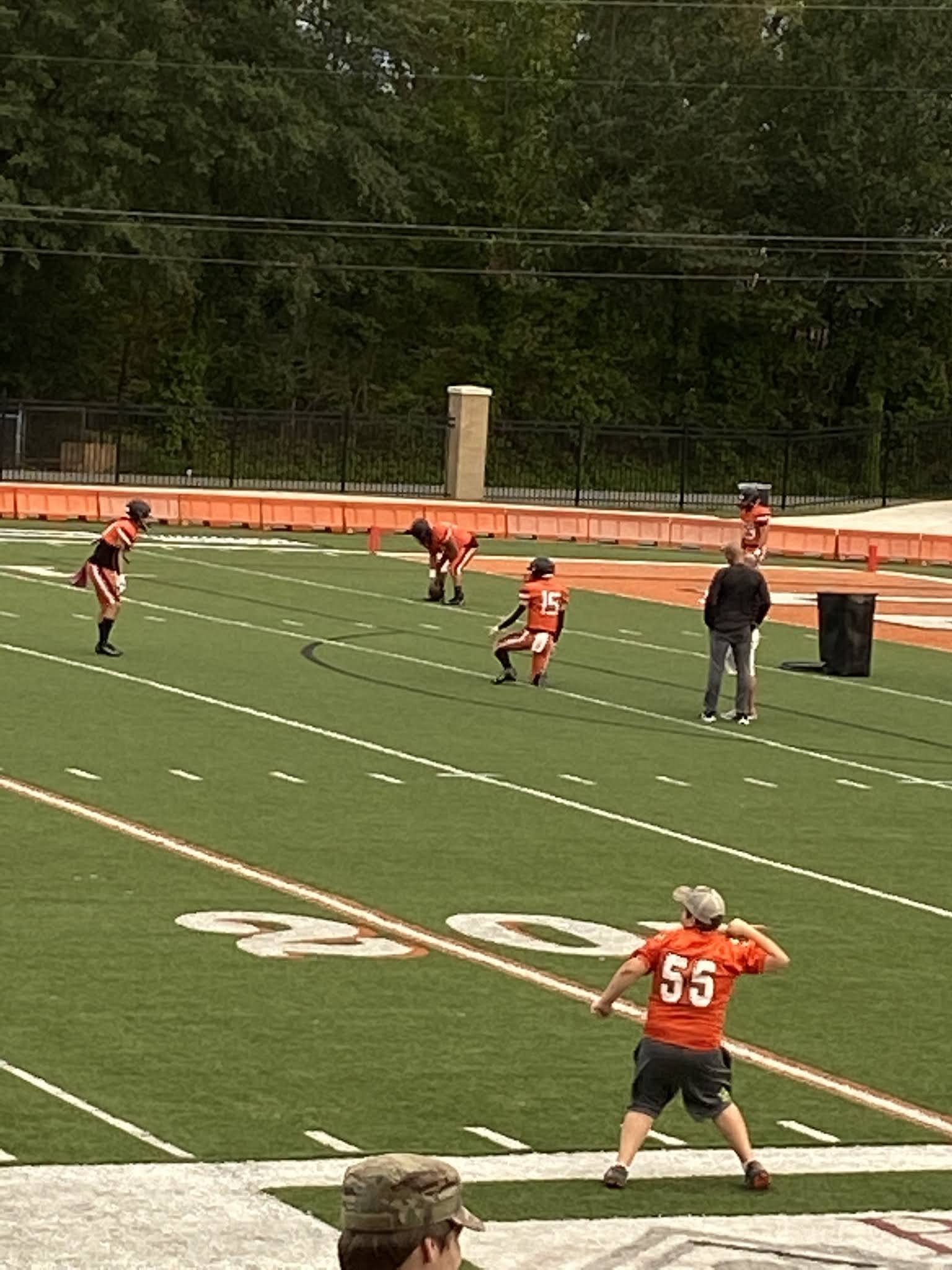
 5:50 pm  // Pre-game warmup. Love sitting the empty stands watching my boys get ready to play. Love that Jude has the maturity, patience, and interest to take it all in as well. 


6:41 // Carter was a captain for tonight's game. Learning to accept this Senior business and not let it hurt my heart every time I think of it being the "last time" for this or that is HARD. Just trying to take each day of this Senior year, live it fully, and to record the memories on my heart.


6:57 pm // Got to watch all three boys run out of the helmet because the elementary players were announced and ran out before the big boys. Watched Jude smile the entire time he was running. Such a big and fun opportunity for him. Also, he lacks full control of his legs as he runs. He looked a little like me when I run. We won't tell him that though.


7:00 pm // A rare selfie of the two of us. We don't normally think to take photos of us together, so capturing this today for this project was nice. 


9:10 pm // These were actually taken Saturday morning off our schools replay of the game, because I did not have my big camera at the game and I was too busy enjoying the game to snap a lot of photos. Not sure how I will put these together in the album and I fully expect them to be blurry, but I wanted to make sure and capture this memory. 

As a Sophomore Ethan doesn't get in often. He got in towards the end of fourth quarter, got a pass thrown to him, and gained a few yards. On the next play the ball was thrown to Carter, who is our main wide receiver, and he scored his first touchdown of this season. Because Ethan was still on the field, they met up in the end zone to celebrate. It was a moment that was so much fun to watch and will make for an amazing memory for both of them. 


Not sure how I will complete my album or if all the photos (and some I didn't share) will make the final cut, but I wanted to share a few favorites and start getting my brain in a space to create.

Thanks for stopping by!